Project Overview
Introduction
In December 2018, Microsoft Edge announced the adoption of the Chromium open-source project for the development of the desktop version of their browser, allowing for better compatibility for their customers and less fragmentation of the web for developers. Adopting a widely used open-source codebase meant that Edge was no longer having to play catch-up with competitors such as Google Chrome, and allowed Microsoft to instead focus on creating a better web browsing experience for their users.
I joined the team shortly after the announcement. From a business perspective, the need to differentiate our browser from competitors by creating a superior experience resulted in a big investment in design. New features, improvements to existing features, and the application of Microsoft’s Fluent design language to Chromium meant that the Edge design team grew rapidly.
As the number of designers grew, however, the potential for inconsistency also grew. It started to become apparent that scaling the UX of the browser through new hires, without standards in place, would only increase design divergence. I was brought onto this project to help alleviate this issue by setting up an Edge design system.
While Microsoft had its Fluent design systems in place already, starting from scratch on the new Edge gave us an opportunity to help guide the design direction of other products at the company, rather than following them. Our team worked closely with the Fluent design team to align our vision of the visual look-and-feel of our future-facing products. The new Edge browser was meant to be a true “north star” product, one that could set the tone for the other modern products that Microsoft is building.
To comply with my non-disclosure agreement, I have omitted and changed any confidential information in this project. The designs presented here may differ slightly from the live versions, and do not necessarily reflect the views of Microsoft.
Project Introduction
My Role
I was brought onto this project with the main goal of helping to create a cohesive design system for Edge. This meant thinking beyond the UX needs of individual feature areas to apply patterns across the entire browser. It meant unifying the existing patterns that already emerged, as well as improving upon patterns that we adopted from Chromium.
I worked the Edge Core UX design team as well as the UX engineering team responsible for implementing the components used in the browser.
Planning
Goals of the Design Framework
As with software engineers, designers all have different ways of working. Starting with a blank canvas, each designer will do something slightly different to transform that canvas into a design. Much of this work is repetitive, and can be standardized by creating a framework of patterns and components.
I began work on creating a cohesive Edge framework to with several key goals in mind
- Eliminate inconsistencies between different design files, designers, and feature areas.
- Increase communication efficiency between design, product, and engineering teams.
- Make design updates later in the design process easier.
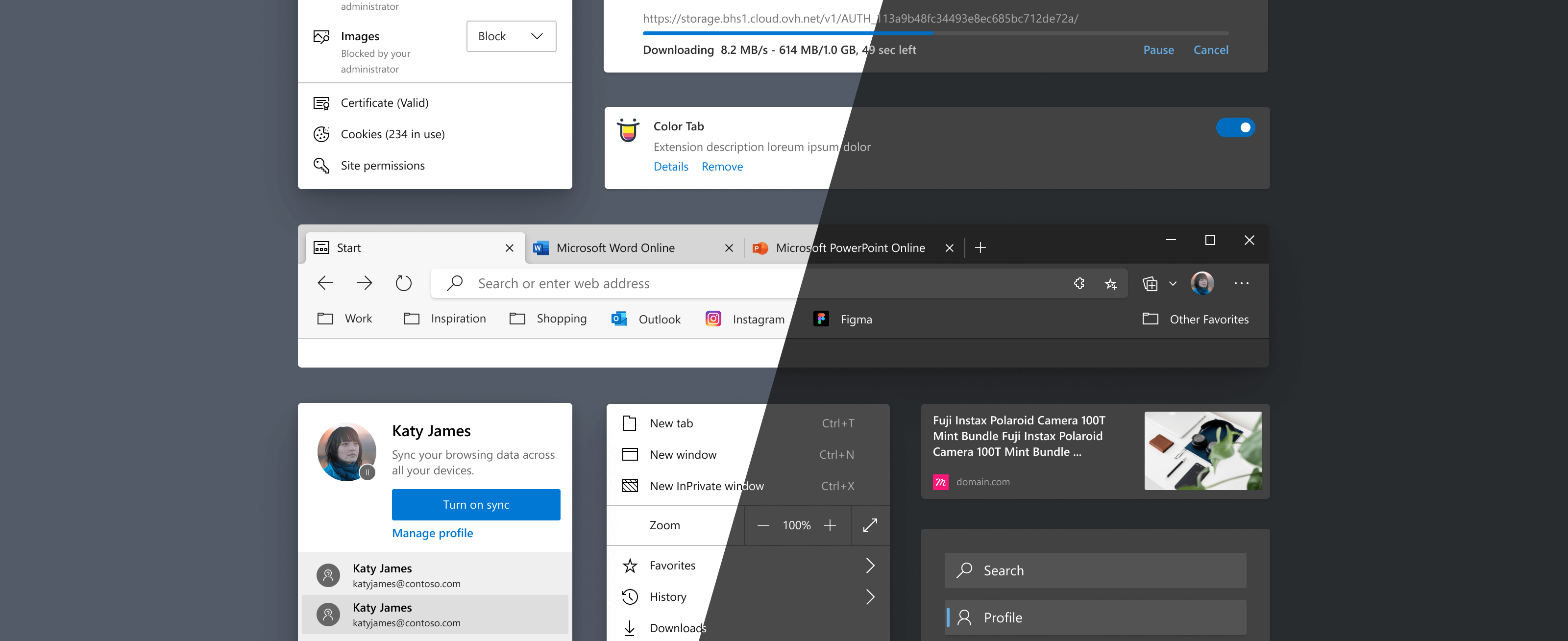
An example of what happens when a design system isn’t in place. Five different browser frames by five different designers, all with subtle differences. Engineering teams constantly had to ask which design was most current one, and designers had to do lots of manual work to change their files once a change happens.
Building the System
Laying the Foundation
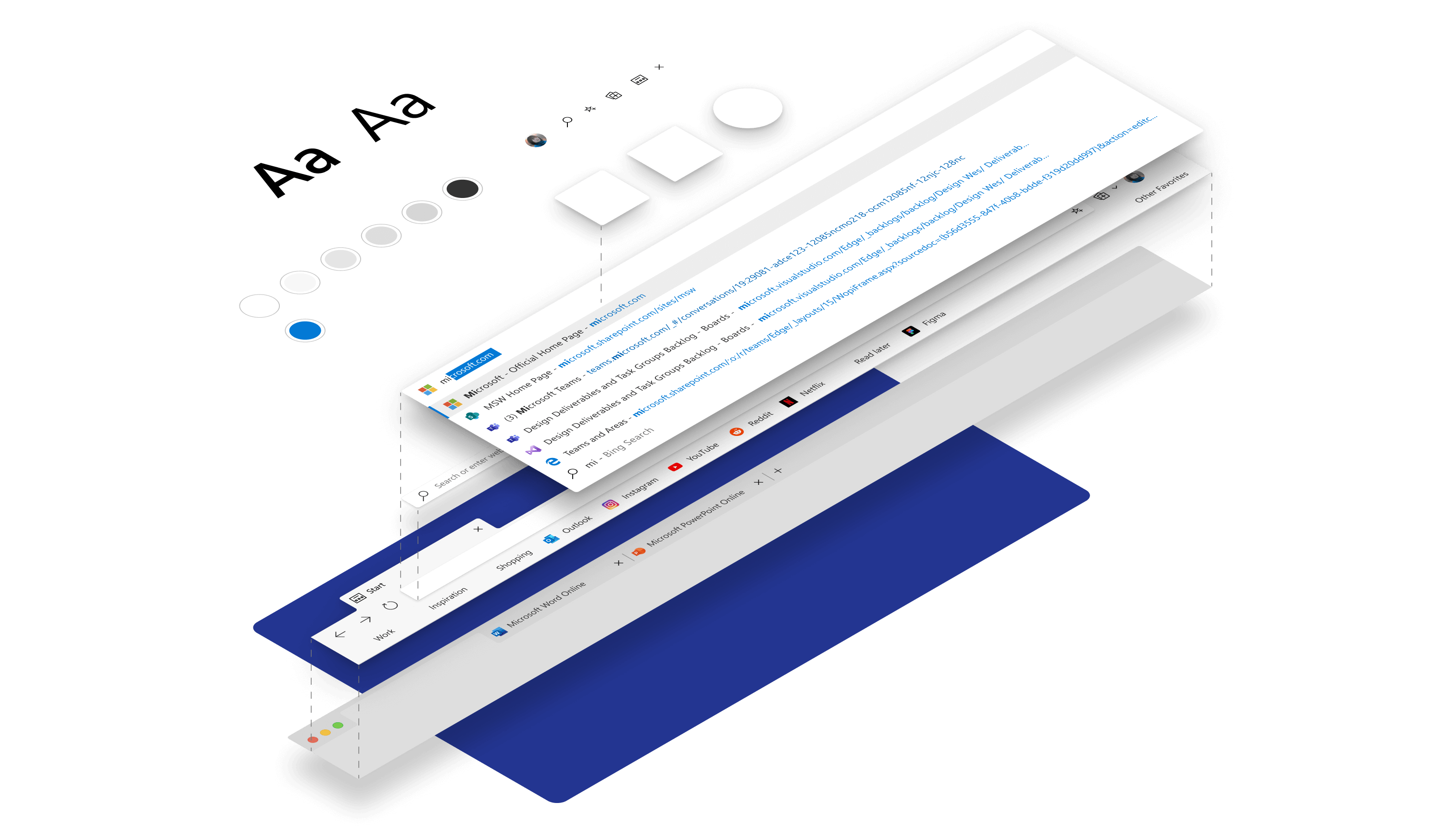
My team, Edge Core UX, worked closely with the Edge UX Engineering team to come up with a set of codified, foundational elements. These elements include colors, typography, elevations, and shapes. These atomic elements were what formed the basis for creating a language for Edge.
These foundational components were not limited to Edge, but designed to be open-sourced, available to any team at Microsoft or externally that wants to use them.
Building the System
Creating the Component Library
Traditionally, many design systems have consisted of a sticker sheet of small, atomic components such as buttons, dropdowns, etc. These elements are then taken by each designer and assembled into custom designs to solve each specific design need. While this is a great start, even with such a system, the components can be assembled in such a wide variety of ways that inconsistency remains in the product.
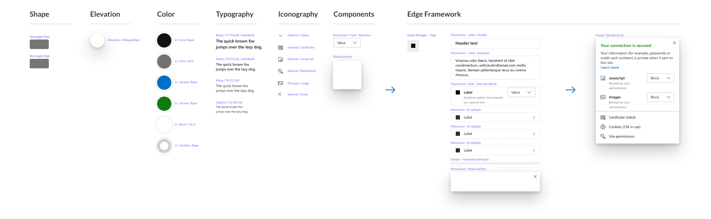
An example of how a typical component is constructed. “Atomic” elements such as components and colors flow into more and more concrete assemblies of components, which define specific patterns, and finally, specific designs.
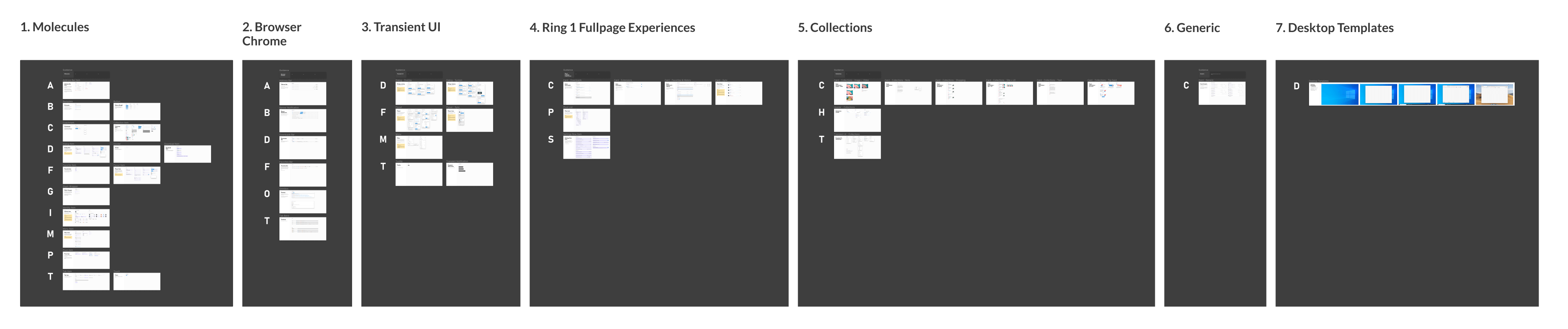
The approach I took was to start with the most foundational components, and them work my way up to more and more specific organisms. The atoms are assembled into generic molecules, which are then assembled into generic organisms. The Generic organisms can be further assembled into specific examples or template components, which are used as a quick starting point for designers.
Creating a system in this type of way means that each assembly can be deconstructed by the individual designer as needed. Since each organism is assembled from smaller atoms and molecules, designers can detach components if needed while still preserving the most omnipresent atomic elements. If a designer quickly wants to get started on a new feature by copying and pasting from an old design, detaching and breaking that larger component will still preserve the smaller atomic-level components, and thus maintaining the overall visual language.
Design Process
Thinking of the Design Team as my Users
The core of user experience design obviously lies with the user. A design system is no different, but my users were the designers on my team who use it. I knew from experience that one of the biggest downfalls with many design systems is that they are perceived to be too slow, cumbersome, or otherwise inhibitory to the creative design process.
If designers didn’t use the design system, then the entire purpose of developing it would be negated. Therefore, I sought out to make the Edge design system as easy to use as possible. This meant intuitive naming, organization, and a consistent structure to all of the components that make up the system.
Prior to beginning this project, the team had switched to Figma, which provided an opportunity to share and collaborate on designs efficiently. Being completely web-based, files never had to be downloaded, libraries never had to be installed, and everything could be shared simply with a link. Using Figma team libraries, the Edge framework could easily be searched and utilized out of the box with very few additional steps.
Organization of the Figma files: Much of the success of organizing the Framework libraries hinged on a deep understanding of Figma and its limitations and capabilities. When searching through shared libraries, Figma imposes an alphanumeric ordering system, regardless of the ordering of individual components in the source file. I made sure that the exact same ordering was present within the Figma file itself to reduce the cognitive load involved with finding individual components.
The Designs
Designs for Customization
As part of the work on creating a design system, customer feedback indicated that we should allow greater customization of the browser for our users. Since we were designing a browser, and not a webpage, this meant that we would have to support dozens if not hundreds of different themes and combinations of elements in different orders.
In the main Framework documents, I accounted for two main themes: dark and light. Because it was impossible to account for all the hundreds of possible permutations to the design system available through third-party themes, I created a system of “rigs” or adjustment files, which allowed designers to quickly swap between different colors, typography choices, icons, and shapes directly within Figma. This way, it became possible to get a sense of how a proposed change would affect the entire Edge system without the manual work of going into individual files one-by-one to make the changes.
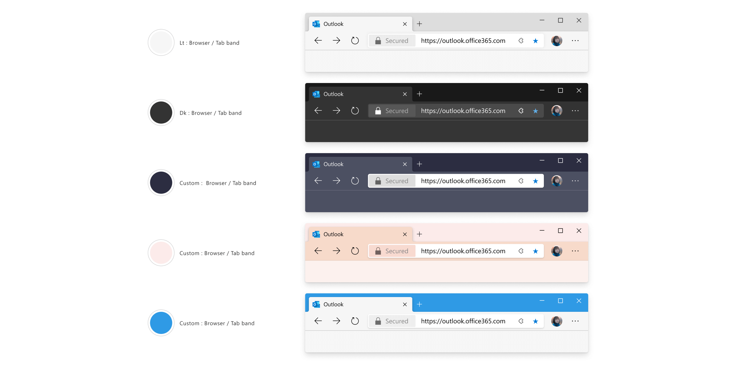
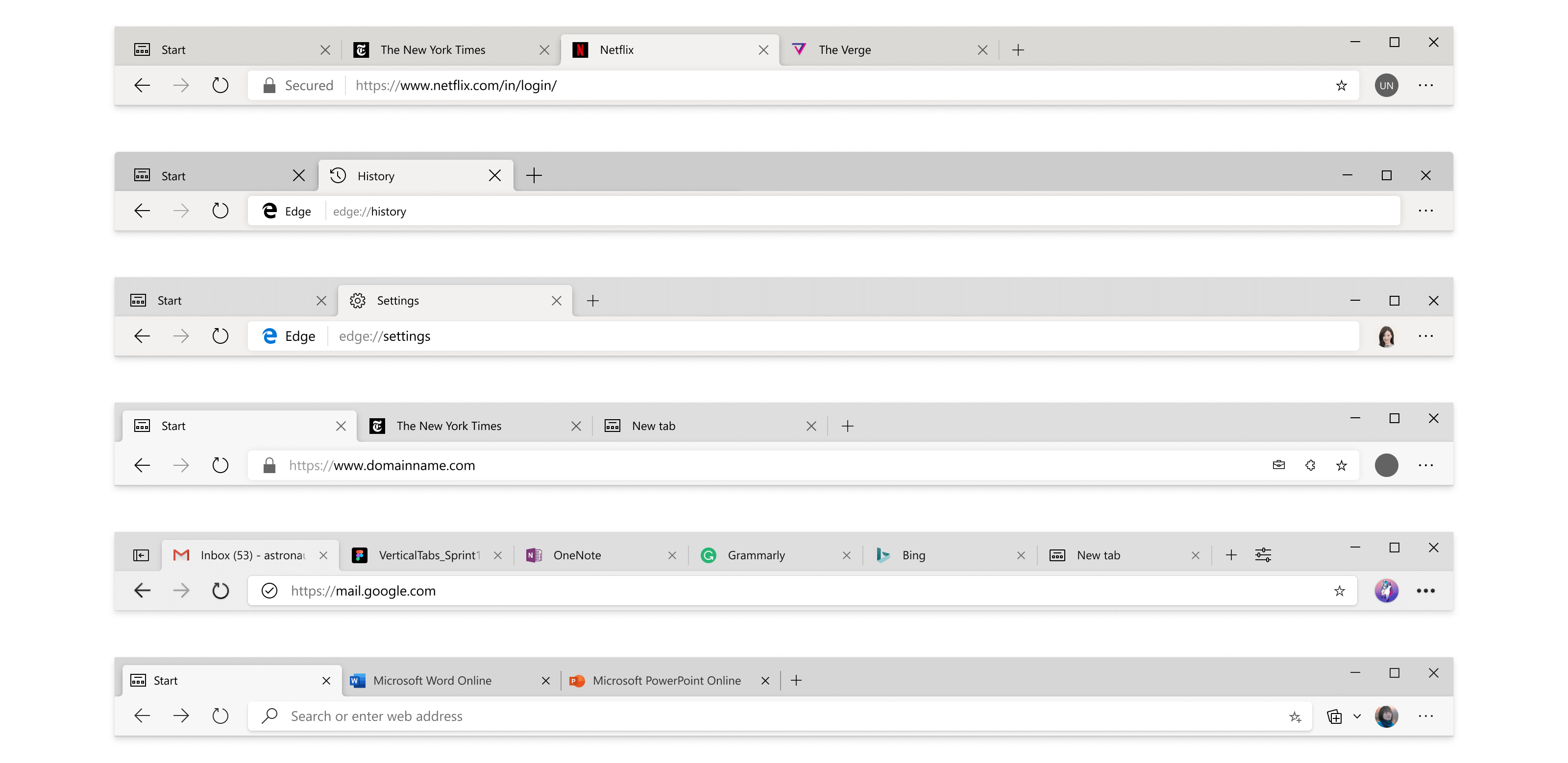
An example of the kind of permutations that could be achieved by experimenting with different properties in the adjustment files.
The Designs
Scaling the System
Initially, creating the design framework meant refactoring the design of nearly all of the UI surfaces of Edge. Rebuilding, componentizing, and meticulously organizing hundreds of pieces of the product was a large task. While building the components, I used the aforementioned Atomic approach, which generally made sense. Progressing from small atomic level components and styles to larger assemblies made sense for the component structure. I initially adopted this same structure to the file organization itself, labelling all of the components as “atome”, “molecules”, “organisms”, and so on.
However, I found that many designers were unfamiliar with the atomic metaphor, and had trouble finding the components they were looking for. Confusion over the naming convention meant that other designers were less likely to engage with and maintain the system. As we added new features, other designers didn’t know where their new components should fit within the atomic system. I eventually moved to a more semantic approach, where I flattened the naming structure, and organized components based on the feature area that they belonged in. This made finding and swapping components significantly easier. The atomic component structure remained, but it no longer dictated the naming of individual components.
Conclusion
Lessons Learned
Create components early
Even if a new component is still being developed, create and add it to the system early. Figma’s flexibility allows the component to be used in designs, even if they change drastically down the road. By implementing components early, files stay easy to maintain, and additional effort doesn’t have to go into manually updating them later.
Educate the team
Using a design system is something many designers are still unfamiliar with. Some of that is due to unfamiliarity with the capabilities of Figma, and some of it is simply due to getting used to a new workflow. In creating this system, I mastered Figma and developed many tips for improving my workflow. I eventually consolidated these learnings into a document.
Dynamic, not static
One of the most important considerations of any design system is to ensure that it can be maintained and built upon. One of the biggest places this manifested itself in our system was with colors. Typography, iconography, and shapes tended to stay fairly consistent, but colors proved to be a place where we were constantly needing to make improvements. Accessibility was a primary driver of this, but when we wanted to make changes to the look and feel of the browser, color was the main way to achieve that too. Working closely with the UX engineering team, I helped refine our color system. Because of the way I constructed the Figma framework files, all color changes automatically flowed through one master file down to the hundreds of individual design files referencing it.
Documentation
In the initial push to get the component libraries built, documentation was overlooked at first. Lacking documentation caused some confusion at first, but as the system matured, we more thoroughly built out guides and documents. This documentation was aimed at designers as well as developers. Because of the web-based nature of Figma, documenting the system also meant that PMs were able to go into the Edge system and quickly mock up an idea that they had in addition to design.
Conclusion
Closing Thoughts
While creating a system was a large task, it was well worth the effort. Before the system was deployed, design was constantly having to answer questions from PMs and developers about where they should turn for the latest designs on a particular feature. After the system was deployed, we could be sure that any design files that were built using the system would have up-to-date visual UI elements.
Since the design language and code were shared, development became much faster. Engineers could focus on building features rather than UI - and the same was true for designers. With a shared visual language, designers could focus on the UX of a feature, rather than the UI details.
Armed with the UI patterns provided by the Edge Framework, I believe that the Edge team will be able to focus on improving the actual experiences of using the product, rather than spending time on constantly updating old designs, writing out specs, or re-creating visual UI elements. As our team’s attention turns to features to differentiate us through great UX, we can now focus on what we’re good at: designing great features for our customers.